Choose your niche!
In all marketing blogs this is called THE step to building a successful business.
Unfortunately, the word choice is not to be found in my dictionary. The more I learn, the more I expand my activities, and always with pleasure!
Like last week, when I learned myself to make a wordpress website in one week (due to the eternal “No problem, I’ll just do that too”-mentality). After one week, and much hard work there now webis a new site for the project for which I am selected, “Voor de kunstenaar”. After all these nightly hours, I thought “never again…” But it would be sad to not put to use all that I’ve learned. So, I made a resolution to have rebuilt my own website before fall arrives.
Another new challenge I got my teeth into for the past few months, was designing logos.
The art of omission. Balance between image and typography.
I’m discovering it all and I’m having great fun with it!
Three great businesses, two of which are still in development, have approached me.
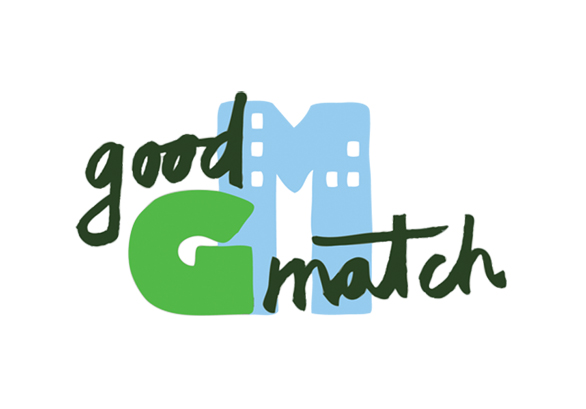
The first was Good Match. A matchmaker between small businesses and charities. They asked for a logo that reflected their sustainable ideals as well as coloring that would correspond with that. I chose soft colors that can be found in many logos of other sustainable organizations. This immediately evokes the right feeling to the viewer. The shape of the M was clear: the officelife as a symbol for small business. The G costed us more time. Eventually we decided that less is more.

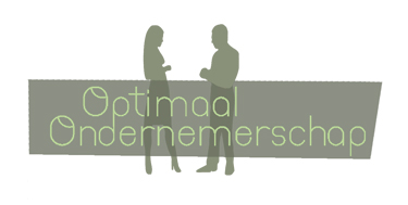
The second company was Optimaal Ondernemerschap (optimal entrepreneurship). A business around coaching. The coaches asked for a logo in their favorite color: taupe. We chose for a meeting of entrepreneurs in a relaxed atmosphere to depict the spearhead of their organization…

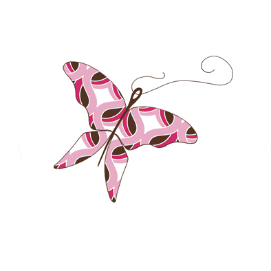
Finally, at a meeting of the organization Don’t-do-it-yourself I was approached by the inspiring Isabelle Zumbrink, the founder of Het Huis van de Vlinders (The House of the Butterflies). The House designs, manufactures and sells trendy and contemporary fashion and home accessories from residual textile, handmade by young women from Utrecht, that experience a distance to the labor market: “by working in The House of the Butterflies girls and women can grow from a small caterpillar to a colourful and beautiful butterfly”. The House wanted a logo that was feminine, trendy, colourful and included a smile. Here’s the result, in the colours of their identity:

A recent blog post on MamaMarketing about the lack of online designers gave me the idea to offer the creation of logos in my online shop. Short, clear assignments as these speak to me.
